If you're not coming here from part one of this pair of blog posts, here's a quick introduction:
During the summer of 2016, I worked full-time as a software engineering intern at a company called MAYA Design. I met some wonderful people, had some awesome experiences, and learned A LOT about what it means to be a full-stack developer. By the time I was placed on the team for the project I'm about to describe, I had already built a fully-functioning website which would be used by potentially thousands of individuals across the country. Cool. My metaphorical feet were already wet, so I figured now was a good time to jump into the world of full-stack development.
Offshore Drilling Co. Web Dashboard
Thinking back now, I couldn't have guessed at the start of this project the amount that I would accomplish in such a small time-frame. What I was being asked to do seemed so above my skill-level at the time. Essentially, the task was to build an interactive web dashboard that would serve as a portal for rig managers at Offshore Drilling Co. (ODC) to view and analyze all kinds of data and metrics from their rigs. I took one look at the designs and I thought "Where do I even begin?" I counted at least six different types of custom data visualizations, and I don't even know how many unique metrics from a database I knew nothing about. I'll try to break down this beast of a project, one step at a time.
The Design
I actually didn't have much to do with the design on this project, and I'm okay with that. The designers at MAYA are such incredible people, and so ridiculously good at their jobs. On this particular project I was working with Nate Bishop, the interim Director of Design of MAYA at the time, and I couldn't have been more fortunate. This guy just gets UI and UX. He would throw new things at me everyday, and all I could think is "How does he do this so quickly?" Still, though, he was always willing to work one-on-one with me to get the job done right, and always pushing me to try things outside my comfort zone.
The design process consisted of an initial assessment of ODC's needs to design some wire frames, followed by a very iterative series of usability tests in order to better understand the experience from the points of view of real ODC employees. The tests were conducted with all kinds of different employees on the Transocean rigs to incorporate many different points of view into the web dashboard's design. If we found that several people were experiencing difficulty using some part of the website, we would change the design and run the tests again. This process was done over and over again until we had the best user experience possible. This process created an interesting workflow for me because the website was constantly changing to reflect the results of the usability tests.
The goal was to create a dashboard that would not only be useful to employees and managers at ODC, but also be incredibly easy and natural to use, even for a first-time-user. Mostly thanks to Nate, I do believe we went above and beyond that goal and designed a truly great web dashboard.
The Data
For my first project, the emergency law inventory, the PostgreSQL database was a relatively small, very manageable size. Plus, I had built it myself, so I knew exactly where to find anything I needed for the website. This project was much, much different. For development purposes, we created a static, local version of the ODC database here in MAYA's network. I knew it would be large, but I was still unprepared for the scale of this SQL Server database. With hundreds of tables on my hands, each with anywhere from tens to tens of thousands of records, I was in pretty deep. That's not to mention the fact that my working knowledge of offshore drilling terminology was next to non-existent when I first started this project. It certainly didn't help that reading every table and column name was like trying to read a different language.
The other engineer on the project was Michael Boselowitz, a four year veteran at MAYA. Mike and I quickly realized that the queries required to return the data we needed would likely require over five minutes to run. To tackle this problem, we implemented a caching system that would store our already filtered data in another, separate database which could then be queried against much more quickly. We wrote a procedure that would run after some interval of time on the server and refresh this temporary database every so often to keep it up-to-date.
Despite this caching system, we still weren't quite comfortable with the load times of our web pages, so some further optimization was necessary. This optimization ultimately came in the form of speedier SQL queries. When writing SQL, it's usually trivial to select a superset of the data that you actually need, and then parse that data on the server. This is okay sometimes, when the data set is relatively small, but not in our case. As a result, we needed to improve our queries, selecting only the data we needed for each individual web page. Due to the complexity of the ODC database, this was definitely not a simple process. In fact, some of the SQL queries we used to refresh the tables in our temporary database were over a hundred lines long. Did I mention I had never used SQL Server before this project?
The Visualizations
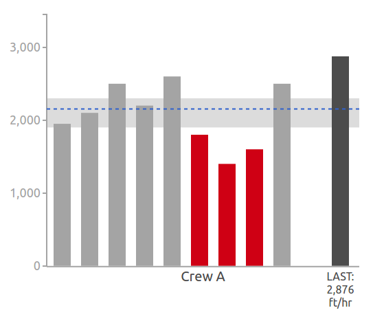
It would have been trivial to re-shape our design in order to work properly with some pre-made commercial data visualizations, but then it wouldn't have been a ODC web dashboard, it would have just been generic web dashboard. On a recommendation from Mike, I decided to look into a JavaScript library called D3, which is widely regarded as being a great library for completely custom data visualizations. After some messing around, I decided that this was definitely the way to go.
The thing about D3 is that it pretty much makes you do all of the work. It's essentially just a library that provides some useful functions to apply logic to displaying svg images on the screen. This is great because it means you can essentially create any data visualization you want, completely customized. On the other hand, this means that creating a visualization requires quite a lot of work because you have to tell D3 exactly how you want everything to look and function. With a large number of custom visualizations to do, I ended up getting the job done in around 1500 lines of code.
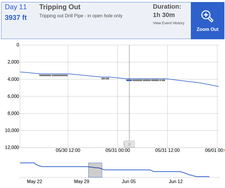
The Time-Depth Curve
I think that this visualization in particular deserves some spotlight – a completely interactive time-depth plot of time vs drilling depth for the entire history of a well. When zoomed out, the user can see the entire history of time vs depth, and drag a bar from side to side to see the depth at different dates. When zoomed in, rectangles appear under the curve which represent events that occurred on the rig. When the bar is dragged under these rectangles, they become highlighted and display information above the graph about the event that they represent. All of the data comes straight from the database, and the graph is built entirely with jQuery and D3.js.
Conclusion
All things considered, I couldn't be happier with my internship at MAYA Design. I went in with virtually no expectations, so the amount I've improved as a developer over the past three and a half months is incredibly satisfying. I helped create two fully-functional, meaningful websites with two very different stacks. I also formed a lot of close relationships with the great people here at MAYA. There's not much more to ask for from a summer internship experience.